
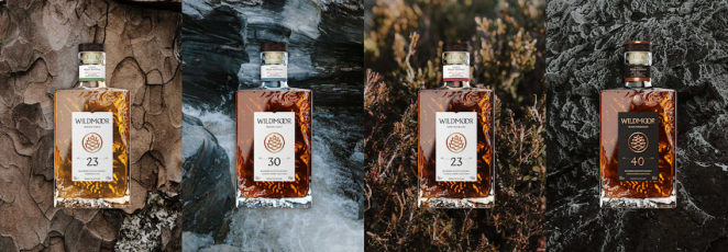
Culture-first creative agency LOVE have helped design and create Wildmoor, a new seven-strong range of whiskies by William Grant & Sons (WG&S) inspired by Scotland’s rugged beauty. LOVE was brought on board to help fashion WG&S’s stock of high-aged whiskies into a new-to-world brand that would reflect both the incredible liquid craft of these whiskies and the wilderness inspiration that sits behind them.
Identifying an emergent urge for escapism and return to nature among city dwelling luxurians, LOVE saw an opportunity for a new take on Scotch whisky – one that steered clear of sun gilded glens and tartan to conjure a more visceral version of the landscape.
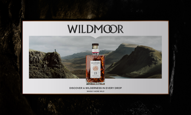
Wildmoor’s ‘chiselled from stone’ aesthetic is inspired by the stylistic minimalism of Japanese spirits brands. It’s elemental textures and forms capture the drama of the Scottish wilderness without disrupting the subtle sense of optimism that underpins the brand’s confident and adventurous messaging.
To learn more, we spoke to Chris Jeffreys, Creative Director at LOVE.
What was the brief for the brand?
We already had a great relationship with William Grant & Sons. This time, they approached us because they had built up a large stock of high-aged Scotch whiskies, which they described as flavour maps of Scotland.
They wanted us to look at the luxury whisky category and build a whole new brand proposition that would chart new ground, that would reflect both the incredible liquid craft and the wilderness inspiration that sat behind them.
How did the initial pitch/brainstorming phase go?
With an agency ethos ‘we see what you won’t’, these early phases of a project give us a great chance to really get under the skin of what a potential brand could be. That meant exploring possible brand stories, the history of the liquids, the behaviour of the wider whisky category and opportunities within culture. All things that could provide exciting jumping off points for the project.
We identified an emergent urge for escapism and a return to nature among city dwellers, especially in Asia. There was already a strong passion for whisky, but with an aesthetic that wasn’t currently being served by Scotch brands.
Describe the purpose of the brand and its target audience
WIldmoor is a new take on Scotch and its relationship with Scotland, moving away from the tourist friendly imagery found in the category, with sun gilded glens and purple heather. Instead, it conjures up a raw and elemental version of Scotland, fused with a minimalist aesthetic that’s more typical of Japanese whiskies.
In doing so, we hope to capture its Scottish provenance in a way that appeals to a modern affluent consumer, one that’s got an interest in reconnecting to nature. Our initial focus was on Asia, but the concept is one that can resonate at a global level – it speaks to anyone with a discerning eye for something authentic, rugged and real.
What was your thinking behind the branding solution?
The visual identity for Wildmoor is bold and contemporary. With a “chiselled from stone” aesthetic that gives it an enduring, timeless quality, it captures the drama of the landscape without disrupting the subtle sense of optimism that underpins the brand’s confident and adventurous messaging.
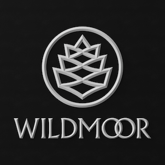
This cinematic terrain is reinforced through the brand mark, where we used Wildmoor’s ‘W’ and ‘M’ letters to construct a Scottish pinecone form and, with the wordmark, give a sense of valleys, mountain peaks, waves and moorlands.
The wordmark plays with typographic overlaps, the linking of the two ‘o’ characters hinting at two whisky barrels being blended together. It creates a highly distinctive, recognisable brand asset.
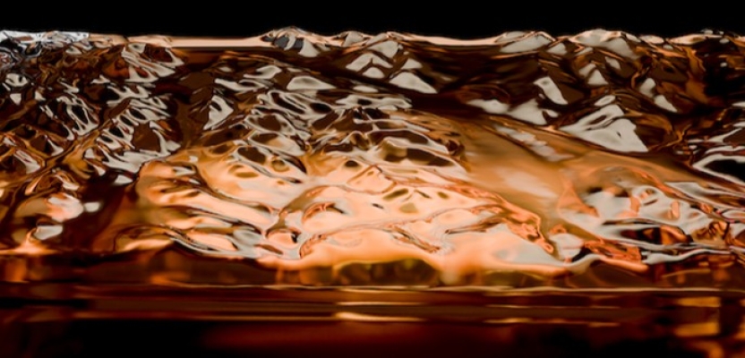
What really sets Wildmoor apart though – enhancing its luxury credentials in an innovative way – is its bottle. We wanted it to feel like it had been cut from the very landscape it sought to express. We used open-source topographical models to apply an accurate three-dimensional relief that captures all the elemental textures and forms, so it’s a literal slice of the Scottish highlands.
Did you learn anything new during the project?
We’re no strangers to developing packaging design for global brands. With Wildmoor, everything was created from scratch. Every project, no matter how experienced you are comes with some type of learning.
Every large spirits company has their own New Product Development team and their own ways of working. It requires significant collaboration between agency, NPD and Marketing to get to the right solution. The design went through a lot of tweaks, but we’re really pleased that the final product is faithful to our initial concept.
What was the biggest challenge? How did you overcome it?
Travelling through the epic wildernesses of Scotland with our photography team to capture imagery for Wildmoor was quite a challenge. Our ECD, Dave Palmer is into his mountain walking and he knew an accessible spot to capture the content for Black Mountain, leading us 3000ft up to the precarious Black Cullin ridge on Skye.
Here, we experienced sun, rain, snow and gales, all in one day. Wildmoor is an elemental whisky, and we certainly got ‘elemental’. Our senior account manager Lucy proclaimed it was the first and last mountain she’s ever climbing.
What kit/tools/software were used to create it?
We mainly did the branding design and bottle labels in Adobe Illustrator - which is great for 2D development, but Wildmoor is a 3D experience. The topographical bottle and fluted embossed logos were really important to deliver the tactility we wanted.
We took an open-source relief map of Scotland into Autodesk Meshmaker, which we then transferred onto the bottle. The volumetric bottle itself and the 3D logos were done in Autodesk Inventor by our talented Design Director Nick. Spatial design was created in Sketchup and Modo.
What details are you most proud of and why?
It’s less the details we’re proud of, but more the bigger picture. To create a new-to-world brand for an established whisky maker like William Grant & Sons to add to their global spirits portfolio was such an incredible opportunity. To see such a positive response to Wildmoor from consumers and brand teams from countries and cultures so different to our own is quite amazing really. We hope we can give them a taste of Scotland wherever they are.
What visual influences fuelled your solution?
Within Scotch whisky packaging you will find category codes that have been in place for decades. Things that signal that it’s Scotch and it’s a premium product. Gold foils, bold, masculine colours, ‘heather and weather’ photography, tall bottle shapes etc. For Wildmoor, we wanted to break some of these codes to bring something different.
We saw that there wasn’t a Scotch behaving like their cooler Japanese whisky cousins, who have their own way of doing things. They capture a pureness and connection to nature, which was our intention for Wildmoor. So we borrowed some codes from them to create something that appealed to both sides of the world. For our comms and spatial designs, we were looking to brands from outside the category that do ‘Nature and Luxury’ well, brands like Moncler and Canada Goose. We hope that in doing this, people who connect with those kinds of brands will find appeal in Wildmoor.
What do you hope it achieves for the brand?
Cut-through and a path to permanence, a wise spirits industry figure once advised us it takes a decade to establish a spirits brand. So we want to see this still on cocktail bar shelves in 2034.
What would you do differently if you could do it over again?
We’d take some waterproof trousers on the photoshoot.
Credit list for the work?
Dave Palmer - ECD
Chris Jeffreys - Creative Director
Russell Ashdown - Creative Director
Nick Johnson - Design Director
Matthew Cooper - Senior Account Director
Lucy Barber - Senior Account Manager
Mariella Cattley - Account Manager
Owain Thomas - Senior Copywriter
Luke Wadsworth - Senior Creative
Jane Badu - Senior Creative
Reyna Maningding - Creative
Alex Hindle - Head of 3D Art
Julia Moller - Junior 3D Artist
Helen Davies - Senior Production Manager
Simon Bradley - Senior Artworker
Sophie Knott - Senior Creative Artworker